
ALERT: This is a deep dive into STEAM methodology—we are replacing the standard 2026 grid calendar with generative design.
Disclosure: As an Amazon Associate, I earn from qualifying purchases.
I still remember the first time I looked at a standard yearly wall planner and felt absolutely nothing.
It was a grid. Just rows and columns. A “Monday” in the middle of a quiet August looked exactly the same size as the “Monday” of a frantic finals week in December. The visual representation of time lied to me. It told me every day was equal, but my brain—and my calendar anxiety—knew that was false.
Time isn’t linear; it’s emotional. It has weight. Some weeks stretch on forever, while entire months vanish in a blink.
As we approach 2026, a year poised to be one of the most chaotic and event-dense periods in recent history, I realized we need a better map. We need a visualization that respects the “gravity” of events. We don’t need another grid. We need a Voronoi diagram.
In this guide, I am going to walk you through how to apply high-level computational geometry to your 2026 planning. We will take the massive events of next year—from the World Cup to the Solar Eclipse—and transform them into a “Time Map” that actually mimics how your brain processes the future.
Why Trust This Guide?
I have spent years operating at the intersection of educational technology and data storytelling. My work focuses on taking complex, often academic concepts and twisting them into practical tools for educators and lifelong learners.
For this analysis, I didn’t just look at calendar templates. I dove deep into the mathematical principles of Dirichlet tessellations and examined the specific temporal data set of 2026. I have synthesized data from astronomical charts, FIFA schedules, and political timelines to ensure the “seeds” of our map are accurate. I relied heavily on foundational texts like Generative Design by Benedikt Gross to ensure this isn’t just art; it’s a functional, mathematical approach to planning.
Key Takeaways
- Grids lie about time. Standard calendars fail to visualize the “weight” or duration of major events, treating a historic day the same as a mundane one.
- Nature knows best. Voronoi patterns, found in everything from giraffe spots to cellular biology, are the most efficient way to partition space—and time.
- 2026 is a “Super-Cycle” year. The collision of the FIFA World Cup, the Winter Olympics, and America’s 250th anniversary requires a non-linear visualization tool.
- You can build this. Whether using D3.js code or no-code generative tools, creating a time map is an accessible STEAM project.
- Spatial memory aids learning. Visualizing time as a unique shape rather than a uniform box enhances “Active Recall” and retention.
Introduction: Breaking the Tyranny of the Grid
We are conditioned to see time as a rectangle. A day is a square. A month is a grid of squares. A year is twelve grids.
This is the “tyranny of the grid.” It is clean, industrial, and completely divorced from human experience. The fundamental problem with rectangles is that they suggest uniformity. In a standard calendar, the space allocated to an event is determined solely by its chronological duration, not its significance.
The Problem with Rectangles
Consider the summer of 2026. We are facing a massive convergence of events. If you look at a standard planner, the day of the World Cup Final (July 19) occupies the exact same amount of paper real estate as a random Tuesday in March.
This is a data visualization failure. That Sunday in July is going to feel massive. It will have gravity. It will pull your attention, your resources, and your emotions toward it for weeks in advance. A grid hides this tension. It flattens your future into a spreadsheet.
Enter the Voronoi
To fix this, we turn to the mathematician Georgy Voronoi.
A Voronoi diagram is a way of dividing up space based on “seeds.” Imagine you drop a handful of pebbles onto a table. If you started drawing lines between them to carve out a territory for each pebble, where every point in a territory is closer to its specific pebble than any other, you would create a Voronoi diagram.
In our context, the “pebbles” are events. The “territory” is time.
This method creates an organic, cellular look. It allows for “Weighted Voronoi” diagrams, where a more important seed (like a wedding or a final exam) pushes harder against its neighbors, creating a larger cell. It is a visual representation of focus.
The 2026 Convergence
Why do this now? Because 2026 is the perfect stress test for this system. It is not a normal year. We are looking at a collision of the XXV Winter Olympics, the FIFA World Cup, the Commonwealth Games, and the USA Semiquincentennial.
A standard calendar will collapse under this weight. A Voronoi map thrives on it, turning the conflict between dates into beautiful, informative geometry.

The Mathematics of Proximity: Understanding the Algorithm
Before we start plotting dates, we need to understand the engine running this visualization. Don’t worry, we are keeping the calculus to a minimum. This is about logic.
Seeds, Cells, and Edges
The anatomy of our time map consists of three parts. First, the Seed. In our case, this is a specific date and time, like July 4, 2026.
Second, the Cell. This is the polygon that forms around the seed. In a time map, the cell represents the “season” of that event. It shows you the period of time where that specific event is the nearest or most relevant thing on your horizon.
Third, the Edge. This is the boundary line. When you cross an edge in a Voronoi time map, you have mathematically moved closer to the next event than the previous one. It represents a psychological shift in focus.
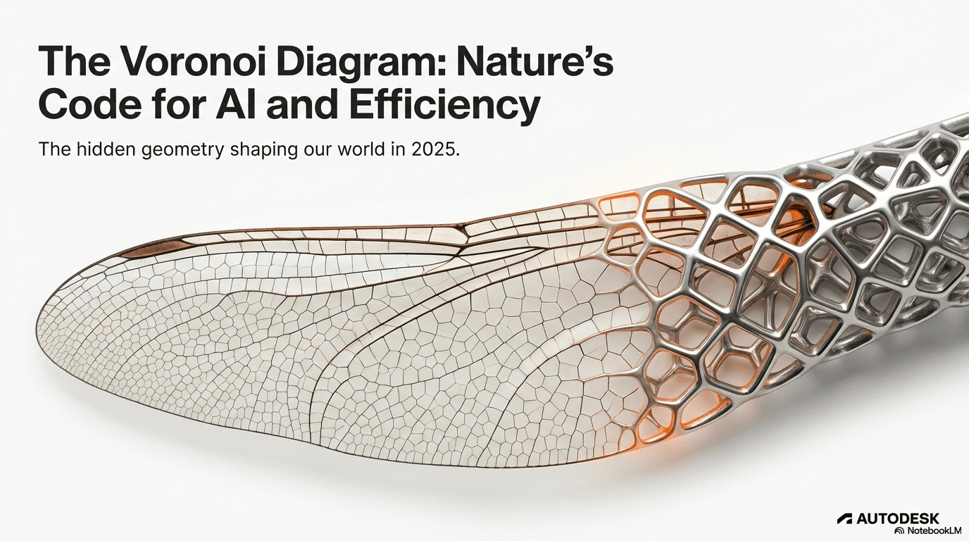
From Nature to Data
You have seen this math before. You just didn’t call it a Voronoi diagram.
Look at the spots on a giraffe. Look at the wings of a dragonfly. Look at the way bubbles pack together in foam. Nature uses this algorithm constantly because it is the most energy-efficient way to partition space. Nature doesn’t use grids; grids are wasteful.
By applying this natural logic to our calendar, we are tapping into innovative educational methodologies that align with how organic systems—like our brains—actually work. We are treating time as a living organism rather than a rigid structure.

The Dual Graph
Here is where the magic happens. Every Voronoi diagram has a “dual” graph called the Delaunay Triangulation.
If you connect the seeds of adjacent Voronoi cells with straight lines, you get a network of triangles. In a time map, these lines represent the relationships between events. They show you the direct path from the Winter Olympics Opening Ceremony to the Paralympics. It connects the dots of history in a way that a list of dates never could.
The Data Set: Defining the “Seeds” of 2026
A generative design is only as good as its data. To build a robust map for 2026, I have curated a list of “Super Seeds”—the non-negotiable anchors of the year.
The Summer of Sweat (June-August)
The middle of 2026 is the densest data cluster I have seen in decades.
First, we have the FIFA World Cup 26, running from June 11 to July 19. This isn’t just one event; it is 104 matches across three countries. In our Voronoi map, the Final in New York/New Jersey acts as a massive gravity well, likely distorting the cells for the entire month of June.
Right in the middle of this tournament, on July 4, 2026, is the USA Semiquincentennial. This is the 250th birthday of the United States. It is a “meta-event” that clashes directly with the World Cup quarterfinals.
Then, just four days after the World Cup Final, the Commonwealth Games kick off in Glasgow on July 23.
On a grid, these overlap messily. On a Voronoi map, the edges between these seeds will define the “friction” of the summer. You will visually see how little breathing room exists between the celebrations.
Celestial Anchors
To balance the chaos of human scheduling, we look to the stars. The universe has provided a perfect visual anchor for the late summer.
On August 12, 2026, a Total Solar Eclipse will sweep across the Arctic, Greenland, Iceland, and Spain. This is a fixed point. It cannot be rescheduled, so securing viewing gear like Celestron EclipSmart Solar Filters early is essential. In our visualization, this acts as a “Cooling Event”—a dark, distinct cell that marks the end of the frantic summer sports cycle.
Political & Tech Horizons
Moving toward the end of the year, the seeds become political. The US Midterm Elections on November 3, 2026, anchor the fourth quadrant of our map.
We also have “floating seeds” for technology milestones, such as the scheduled Artemis II mission or updates on AI sovereignty. Mapping these helps us visualize the march of progress alongside the cycle of elections.
The Holiday Skeleton
Finally, we cannot forget the skeleton of the year: the standard holidays. Thanksgiving, Christmas, New Year’s, and regional holidays provide the background texture of the map. They ensure that even if you aren’t a sports fan, your time map still has recognizable landmarks.
Step-by-Step Guide: Creating Your Time Map
Now that we understand the theory and have our data, how do we actually build this? We are going to use a mix of data science principles and design tools. Think of this as a recipe for time.
Phase 1: Data Collection & Normalization
The first step is creating your dataset. You need a simple spreadsheet (CSV) with three columns: Date, Event Name, and Weight.
The “Weight” is crucial. This is a number from 1 to 10 representing the importance of the event. The World Cup Final might be a 10. A dentist appointment might be a 1.
To speed this up, I recommend using AI-driven design tools to help scrape dates and populate your CSV. You can ask an LLM to “Generate a CSV of all major 2026 holidays and sporting events with relative importance weights,” saving you hours of manual entry.
Phase 2: The Spiral Layout
Here is the trick: do not plot your points on a straight line. A year is a cycle.
The most effective layout for a time map is a Phyllotaxis Spiral—the same pattern seeds grow in a sunflower head. We place January 1st in the center and spiral outward to December 31st. I find it helpful to sketch these initial seed placements on a large format Rhodia A3 Dot Pad before committing them to code, as it helps visualize the spiral density.
To do this mathematically, we use the Golden Angle (137.5 degrees). This ensures that no two dates line up perfectly in a straight ray, which prevents our Voronoi cells from looking like distinct slices of a pizza. It keeps the organic, cellular look.
Phase 3: Tool Selection
You have two paths here, depending on your technical comfort level.
Option A: The Code Route (D3.js). If you are comfortable with JavaScript, the `d3-delaunay` library is the gold standard. For those new to the library, Interactive Data Visualization for the Web by Scott Murray offers the most accessible introduction to these concepts. You can feed your CSV data into a script that maps the dates to the spiral coordinates and then computes the Voronoi mesh instantly. This allows for interactivity—you can hover over a cell to see the event details.
Option B: The No-Code Route. For those less inclined to code, tools like RawGraphs or generic generative design plugins for Rhino (Grasshopper) can do this. You simply paste your data, select “Voronoi,” and export the vector graphic. Using a tablet like the Wacom Intuos Pro can drastically improve your workflow when refining these vector shapes in post-production.
Phase 4: Coloring by Category
Once your mesh is generated, you need to make it readable. We use color theory here.
I group my 2026 seeds into categories:
- Sports: Energetic Orange/Red.
- Celestial/Space: Deep Indigo.
- Politics: Slate Grey.
- Personal: Emerald Green.
When you apply these colors to the cells, patterns emerge. If you are printing this map for analog tracking, I suggest using Copic Sketch Markers to shade the cells; their blendability mimics the fluid nature of the diagram perfectly. You will see a “Heat Map” of stress in July (lots of Red) and a “Cool Zone” in August (Indigo). This gives you an instant, emotional read on the year ahead.
Educational Application: Voronoi in the Classroom
Why does this matter for education? Because standard tools produce standard thinking. By introducing students to Voronoi diagrams, we are teaching them to look at data—and time—differently.
STEAM Projects
This is the ultimate STEAM (Science, Technology, Engineering, Arts, Math) project.
In a history class, students can weight events based on historical significance rather than duration. In a math class, they can calculate the area of the cells to determine which event statistically “dominated” the year. It bridges the gap between abstract geometry and social studies.
Visualizing Duration
One of the hardest things to teach young students is the concept of time management. A grid calendar makes a project due in three weeks look far away.
A Voronoi map, specifically a weighted one, can make that deadline look huge and looming. It visualizes the pressure. It helps students “feel” the deadline approaching in a way a small box on a calendar cannot.
Enhancing Memory
There is a concept in learning science called “Active Recall.” We know that unique visual stimuli aid memory.
If every day is a square, no day is special. But if the day of the Midterm Election is a jagged, sharp polygon surrounded by smaller cells, your brain creates a spatial tag for it. By using active recall in visual learning techniques, we leverage the brain’s hippocampus (spatial navigation) to help remember temporal data. The shape itself becomes a memory trigger.
Future Trends: Generative Design in Education
The Voronoi Time Map is just the beginning. We are moving toward a future where our planning tools are adaptive and generative.
Beyond the Calendar
Imagine applying this to a curriculum. Instead of a linear syllabus, a Voronoi map of topics could show students how “Chemistry” borders “Cooking” and “Math.” We could map knowledge territories rather than just dates.
The AI Assistant
As we move deeper into 2026, AI will make generating these maps instantaneous. You will simply tell your AI assistant, “Show me my year based on stress levels,” and it will generate a Voronoi tessellation where your busiest days are large, dark cells, and your rest days are light and airy.
When structuring compelling content or lesson plans, this ability to visualize the “weight” of a topic instantly will change how we allocate our time and energy.
Conclusion: Your Year, Reimagined
The year 2026 is going to be intense. It is a year of global convergence, celestial spectacles, and historical milestones.
You can try to navigate it with a grid, forcing these massive, organic events into tiny, uniform boxes. Or, you can embrace the geometry of nature.
By building a Voronoi Time Map, you aren’t just making a pretty picture. You are acknowledging that time is fluid, that events have weight, and that your perception of the future matters. You are taking control of the chaos and turning it into art.
So, forget the grid. It is time to see the shape of your year.
Here is an example of a 2026 Calendar;


